CARTO - Research and Development
Multiple projects conducted between October 2016 to August 2017 at CARTO
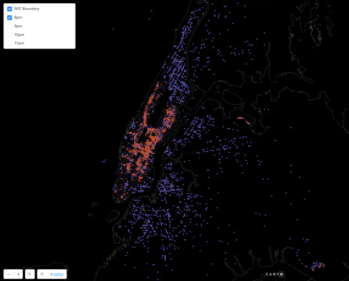
Space-time Autocorrelation using NYC taxi data (2015)
(GIF is linked to original map embed)
(Add more on space time moran’s I)
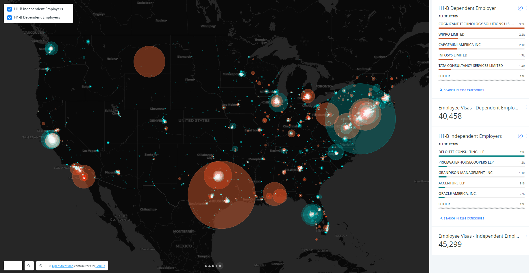
Exploring immigrant work visa reforms in USA
Link to blog post published by CARTO
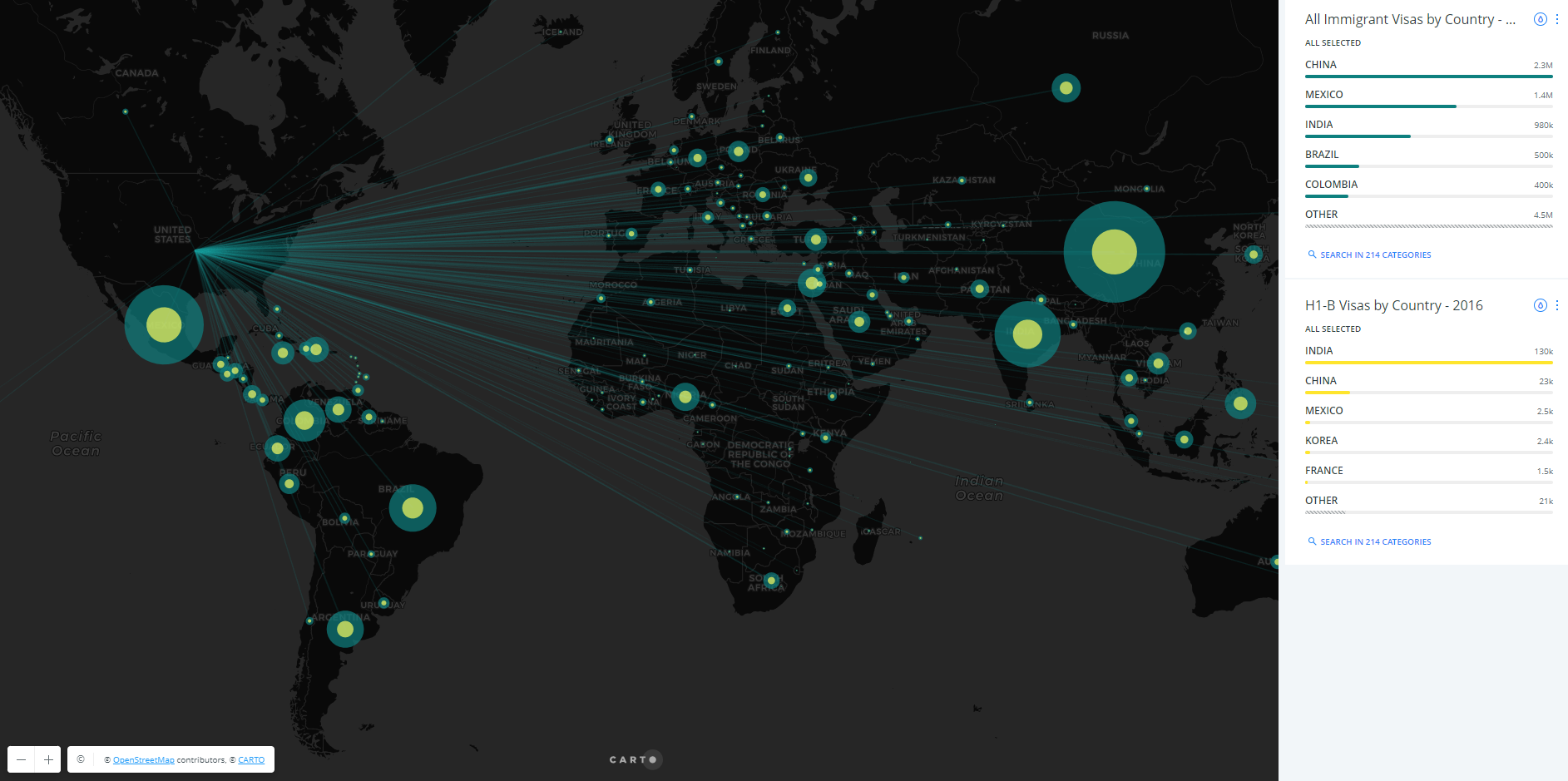
(Image is linked to original map embed)
This analysis explored possible ramifications for the tech industry, and the American economy more generally if the proposed H-1B program (responsible for hiring foreign workers in US) reforms (H.R.670) were to go into effect. Using open government data and analyzing patterns, this blog shows what these changes could mean. This post was also published in technical.ly brooklyn.
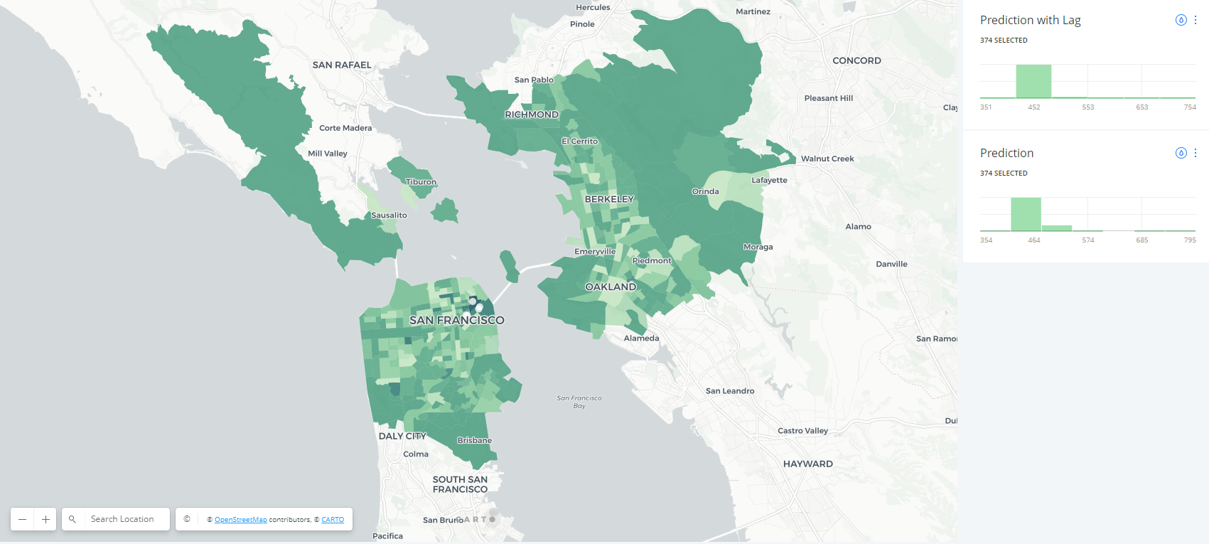
Random Forest Regressor
As a part of developing new analysis tools within CARTO, this project involved exploring machine learning techniques suitable for spatial predictions and its implementation. We used gradient boosting to build an analysis tool that took feature variables as input to predict a target variable in a dataset. A second pass involved adding spatial lag to the technique to enhance prediction accuracy for spatially related features. The map is an example using this tool to predict WeWork desk prices using density and type of use in the area. The tool is currently internal only.Pull request linked
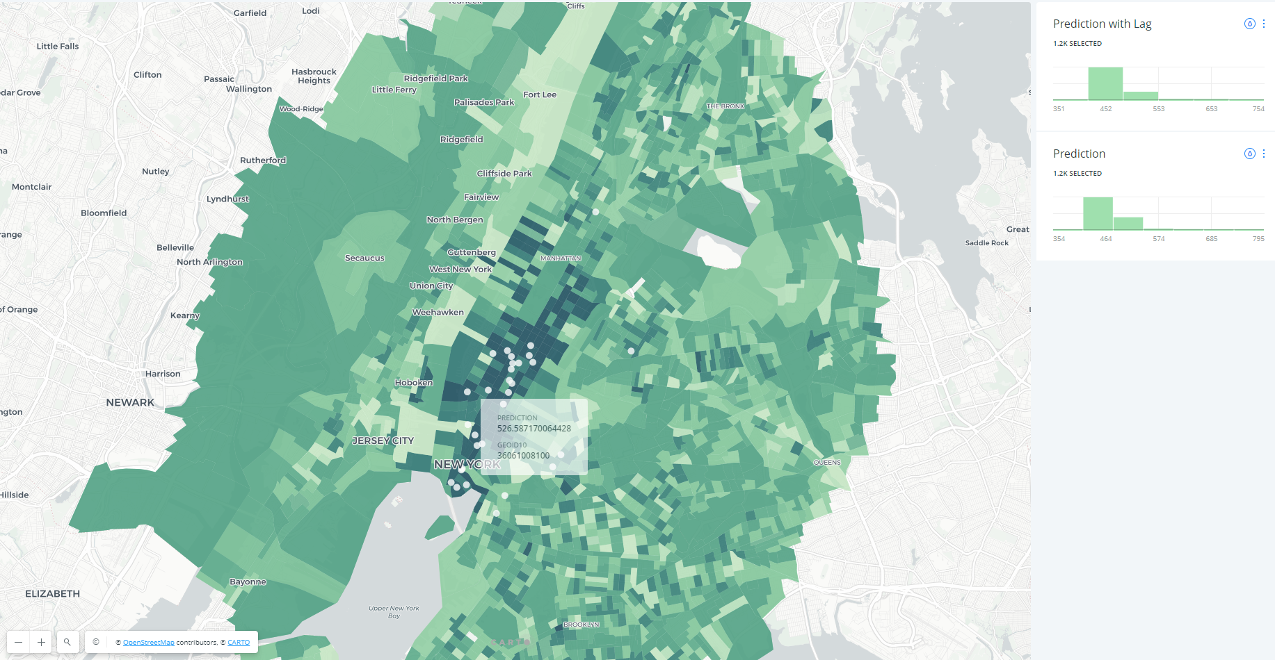
The prediction map (linked to the image above) extends across the country covering many cities.
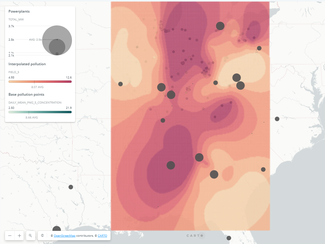
Kriging tool
Mehak Sachdeva
Assistant Professor of Urban Science
My research interests include spatial statistical methods with applications in the social, urban and environmental sciences.